Page 3 of 4
Posted: 06.03.2021 06:37
by Shovel
have been playing with this for fun a bit. The bottom one kinda works for me.
(I'm not ready to leave my 'cu' heritage behind

)
Posted: 06.03.2021 08:46
by uvviewsoft
Nice... it 's not better than current "C with u", though..
Posted: 06.03.2021 12:41
by adnan360
@Shovel
First of all nice work. It looks cool. And at least better than the current one.
I think I like the font and some of the color combinations (2nd one and 3rd one from top) for contrast reasons. Makes it very legible. But I'm not sure about the rounded rectangle border. Multiple roundness is probably used? That's creating a different width on corners. Although it looks cool I don't think it looks professional. No logos I've seen uses this technique anymore. Also if we look at other logos they're getting simpler and the typefaces being used on logos are getting simpler (even though I like the font myself). These stylized typefaces are not being used anymore. Oh, and +1 for making yours flat.
@uvviewsoft
I posted the idea-image in the prev post, it is letter C (square but it can be rounded) with letter T.
I see, I thought you misread my last post. I'll try with the concept to see what I can do.
Also interested to hear what you think about my second variation (Prososal 02).
Posted: 07.03.2021 09:33
by uvviewsoft
about feedback about previous icons: I didn't read all text, and didn't like any icon, sorry. don't try hard to do it.
Posted: 11.03.2021 07:03
by Shovel
Still playing with this for fun a bit... is this modern?
Posted: 11.03.2021 09:00
by uvviewsoft
I dont like it (gray shadow, angled, and why white corners???)
Posted: 11.03.2021 10:02
by Shovel
that is "<ct>" rotated 45 degrees, white corners are < and >
Posted: 11.03.2021 10:12
by uvviewsoft
It's 'too abstract' pic, too many noise
Posted: 13.03.2021 18:26
by adnan360
@uvviewsoft
I posted the idea-image in the prev post, it is letter C (square but it can be rounded) with letter T.
I see, I thought you misread my last post. I'll try with the concept to see what I can do.
Here are some shapes I tried based on your drawing and maybe beyond.
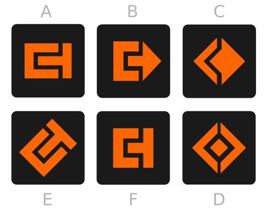
- Shapes 02
- cudatext-shapes-02.png (10.07 KiB) Viewed 5428 times
Well, tbh I don't like them all and they're not necessarily my proposals. They're just ideas. But let me know what you think about them.
EDIT: Oops, sorry. I put the letters on a wrong order.
These are just rough ideas... so...
Posted: 13.03.2021 19:24
by uvviewsoft
nice icons. but I don't like them, TBH. current 'C-u' icon is better for me. I don't have more ideas. maybe stop this?