Page 1 of 4
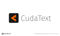
I designed this logo for CudaText
Posted: 26.02.2021 20:12
by adnan360
Hello everyone,
I use Cudatext everyday. I used to use Sublime before and CudaText helped me get off of it. I like the huge range of features it has. And as a FOSS software I like using it.
Being a designer, one of the things I noticed is that CudaText has a logo which has bevels and some design aspects which I don't like (no offense to the designer). So thought I'd design a new logo for the project with my vision. I think a modern logo can go a long way, especially in user acceptance. Modern logos tend to be simple and flat without any 3d aspect to it. So I thought of this logo:

- CudaText logo prososal - 01
The symbol in the logo kind of looks like an angle bracket (<) we use on code (esp. HTML) when looked from a distance. And when you look close, you get an idea that it's actually a "C", which is for CudaText.
I'm still experimenting with spacing, color etc.
Let me know what you guys think.
Posted: 27.02.2021 05:52
by adnan360
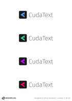
Here are some variations in color:

- CudaText logo prososal - 01 - color variations
Posted: 27.02.2021 09:10
by uvviewsoft
I am sorry,but old logo is more liked by me, I like it's 3d look and C-u letters, new logo has some scifi look, it's strange.
Posted: 27.02.2021 10:07
by Shovel
Looks nice, but I don't think this fits. CudaText is a tool, not a fashion accessory

Posted: 27.02.2021 20:00
by adnan360
I am sorry,but old logo is more liked by me, I like it's 3d look and C-u letters, new logo has some scifi look, it's strange.
Well, many other popular text editors have flat icons or at least have flat versions of it. e.g. Atom, VSCode. So I thought it made sense. If you look into the VSCode icon, it may look as a scifi icon. This is also true for Atom icon.
Looks nice, but I don't think this fits. CudaText is a tool, not a fashion accessory
Can we try a variation of the logo perhaps? Maybe change in color, or shape? Maybe give me a hint on what you don't like about it.
Posted: 28.02.2021 07:17
by Shovel
adnan360 wrote:Can we try a variation of the logo perhaps? Maybe change in color, or shape? Maybe give me a hint on what you don't like about it.
I kinda already have a perfect icon (also rejected by the developer

):
viewtopic.php?f=6&t=2596
Posted: 28.02.2021 13:40
by uvviewsoft
today I thought that I 'd like the 'flat' icon. flat version of current file cudatext-512.png. (app window icon is another one).
@Shovel, can you make flat version of cudatext-512.png? in ur repo, I see it's not flat, if has 'bright light' below the c-u
Posted: 28.02.2021 16:14
by adnan360
I like @Shovel's logo better than the current one. But (a) it's still complex. And from a designer's perspective, (b) why are C and U written as is? Why is the U put inside the C? Are there any reason behind this? Can anyone please explain what does it mean, the little U, that has been kept smaller than the C? Does it mean CudaText compresses stuff?
And what is so great about it? It's a nice logo for the 90s or at a stretch 2000s, but not today. (Again, no disrespect to the designer, maybe it was cool back then.) @Shovel's variation makes it a bit digestible, but still not up to today's standards.
I'm not saying mine is the best and you have to choose mine over others. I'm just trying. I'll probably try more. The rest is up to you.
I understand that the logo has been around for long and letting go of this is tough. I designed the lazarus-ide.org website (not to mention a long time ago). Some others and I had to beg and beg to have a separate website until some of the leaders of the community agreed. We literally had to "attack" (in a way) their old thinking. And today we have a website and it serves a comfortable medium to download, acts as a good source of news/forum posts and showcases features and projects. If others and I didn't push this change, imagine what would happen? It would still be an SMF forum page and people would have to "hunt" for the download page. And even the download page would be on a wiki that would require scanning through paragraphs of text to find out actual download links.
So please think through. Maybe discuss with the community (if there are anywhere else that others are). Community are the users. And users know what feels right to them.
Posted: 28.02.2021 17:08
by uvviewsoft
'what does it mean?' I don't know, FTurtle Lazarus forum user has made it. i liked it. and why to replace it with a new icon, if I don't like new scifi symbol? not colors, I don't like the symbol. it's not for me.
Posted: 28.02.2021 18:10
by Shovel
The icon has been changed to this
https://github.com/Alexey-T/CudaText/bl ... t-1024.png
... but anyway... @adnan360 if you decide to try again, a thought - icon that doesn't look modern, but kinda old, but still good? (beautiful old cars are a thing)
(Does this icon of an audioplayer I use remind you of something?
DeadBeef icon)